Sidelit Wave
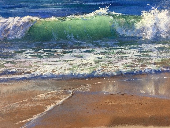
Catching the light – back lighting, side, front light and shadow.
When faced with choosing a green that doesn't clearly define it's quality of warm or cool we can try out the possibilities before we start painting. I's important to think in tonal values - mid, dark and light in each of our possible candidates for the painting. Watch and see how it works.


If you have chosen the coloured tonal range for your wave, that can now be put aside and the concept of the painting can be considered more fully.
This video is a repeat of the lesson. It is not divided into working sections like the following demonstrations.
It is not essential to view it but it does contain a different flow. The sectioned demonstrations are better viewed if you are painting along with the demonstration or want clearer steps.
Composing and drawing the painting to show the elements that we want to give a purposeful view of the way light is falling across the waves.
Start the pastel painting process. Basic Colours chosen, lay in the areas of colour You may be able to see the small section where I varied the background choice to underpaint or not. The underlying pastel layering whether rubbed, wet or left natural and 'active, 'all give me a slightly different option that does affect the upper layers.
We work through the various stages of the painting to the end result.
After several students did their study paintings, Lyn looks at the results and suggests that there are some important differences to remember, avoid or enhance.